One Platform, Two Front Doors: Redesigning the SocialTalent Home Page

Role: Product Lead
Context: Preparing a learning platform for a second product, and a second kind of user
The problem
For years, the SocialTalent home page had one job: get learners into learning. It did that job adequately, but it hadn’t been meaningfully updated in years and it looked like it. More importantly, the platform it fronted was changing underneath it.
With the launch of our interview intelligence product, we would soon have two fundamentally different users arriving at the same front door:
- Interview intelligence customers, who use the platform primarily through Cara: running interviews, capturing candidate feedback, receiving coaching. For them, learning is a secondary goal, if it features at all.
- Learners, who don’t have access to interview intelligence, and for whom learning and development is the entire point.
A home page optimised for one would actively fail the other. A home page that averaged between them would fail both.
The design principle: two clicks
We set one simple bar for the redesign: whatever a user came to do, they should reach it within two clicks. That single constraint did most of the design work for us. It forced us to answer, for each user type, “what did this person actually come here to do?” and to be honest that the answers were different.
The decision: segment on the signal we already had
The tempting version of this project involves onboarding questionnaires, role selection screens, or behavioural inference to work out what kind of user someone is. We did none of that.
We segmented on licence type. We sell either learning or interview intelligence, so a user’s licence already tells us, with commercial certainty, what they’re here for. No quiz, no guesswork, no cold-start problem: the simplest signal available was also the most reliable one, because it reflects what the customer actually bought.
What we built
Two home pages, selected automatically by licence type, each designed around its user’s primary job:
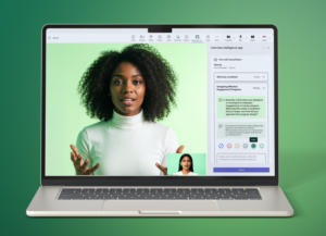
- Interview intelligence users land in their workflow: upcoming interviews surfaced front and centre, with feedback and coaching a click away.
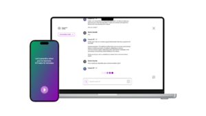
- Learners land in a contemporary learning experience, with dynamic recommendations surfacing the content most relevant to them, rather than a static catalogue.
Both pages share the same design system and the same dynamic, personalised approach; what differs is what each puts first.


What we deferred
As always, the hard part was scope. A project like this attracts nice-to-have features from every direction, and we deliberately kept v1 simple: two user types, two pages, done well. The most requested addition, an insights-focused home page for admins, is a genuinely good idea, which is exactly why it’s phase 2 rather than a v1 compromise. Three half-finished home pages would have been worse than two complete ones.
The results
The redesign shipped with the platform’s evolution into a two-product company, and qualitative feedback from customers has been positive: the platform feels contemporary again, and each user type gets to their core task fast.
What I learned
The best segmentation signal is usually one you already have. We could have built elaborate machinery to infer user intent, but licence type answered the question perfectly because it reflects commercial reality: what a customer buys is the strongest statement of what their users need. Matching the product experience to that truth, and resisting the urge to build cleverness we didn’t need, is what let a small, simple v1 ship quickly and land well.